
HOMELINK
Rebrand
In the dynamic landscape of branding and marketing, the pursuit of a cohesive identity across various platforms is paramount. Yet, amidst this pursuit, lurks a challenge that often proves daunting: the replication of a singular color scheme across all media.
This challenge becomes particularly pronounced when introducing a new identity and graphic system, where consistency is key to establishing brand recognition and resonance.
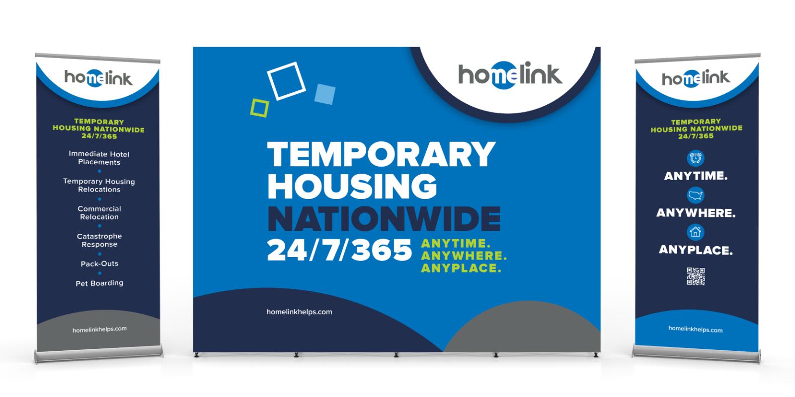
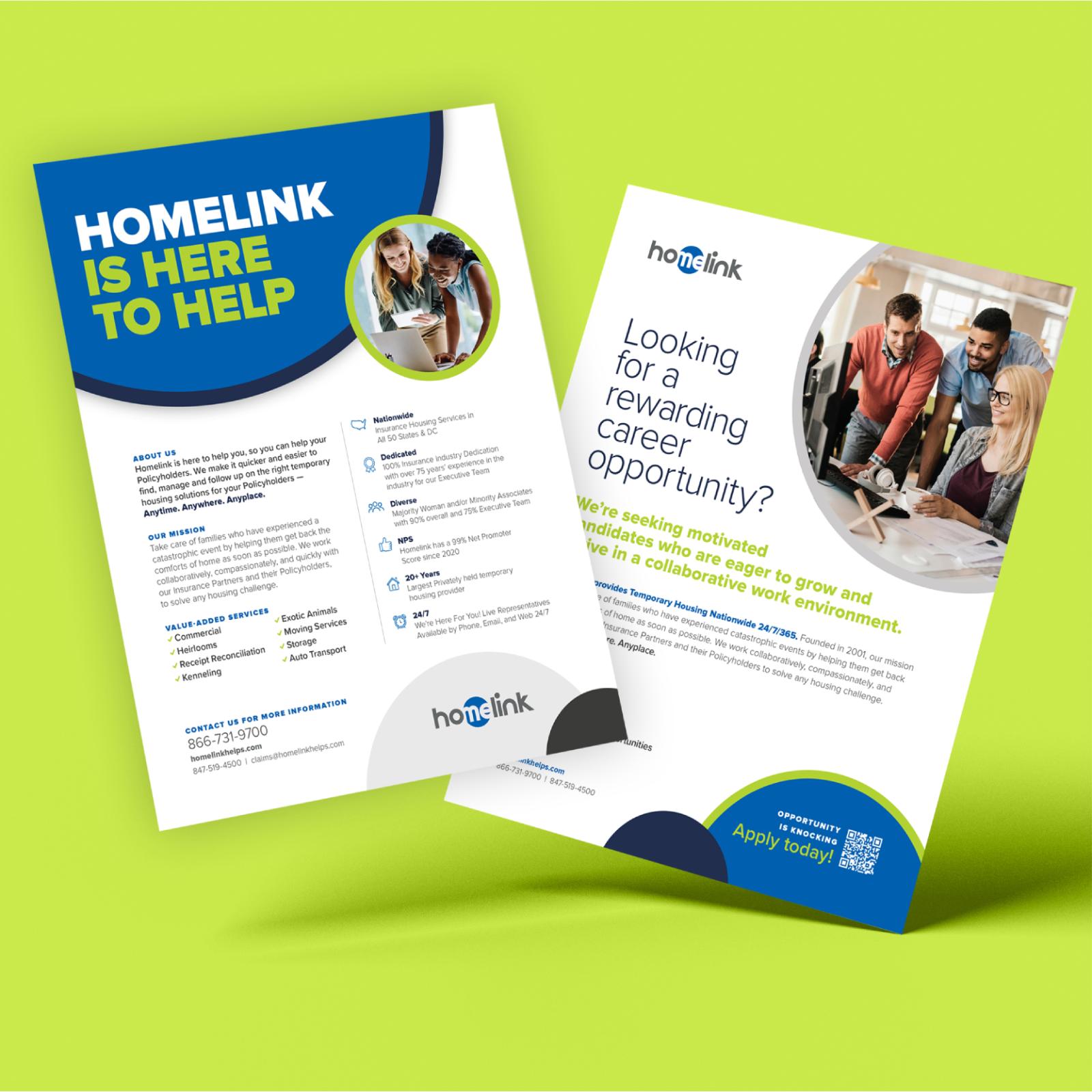
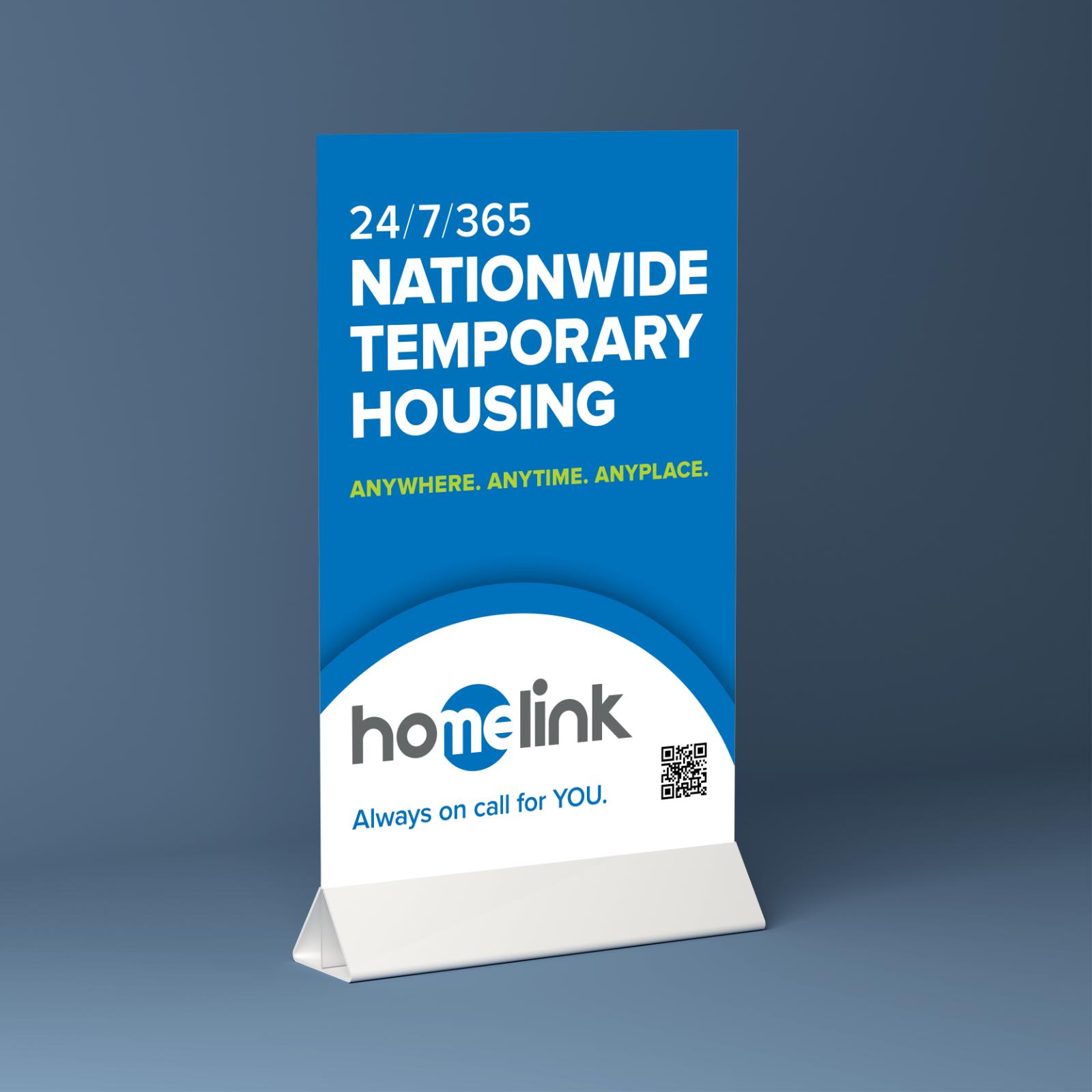
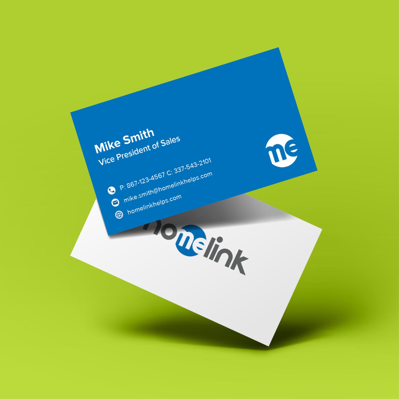
Homelink Corporation is the nation’s premier provider of temporary housing for insurance partners and their policyholders. After experiencing a catastrophic event, they help families regain the comforts of home as soon as possible.
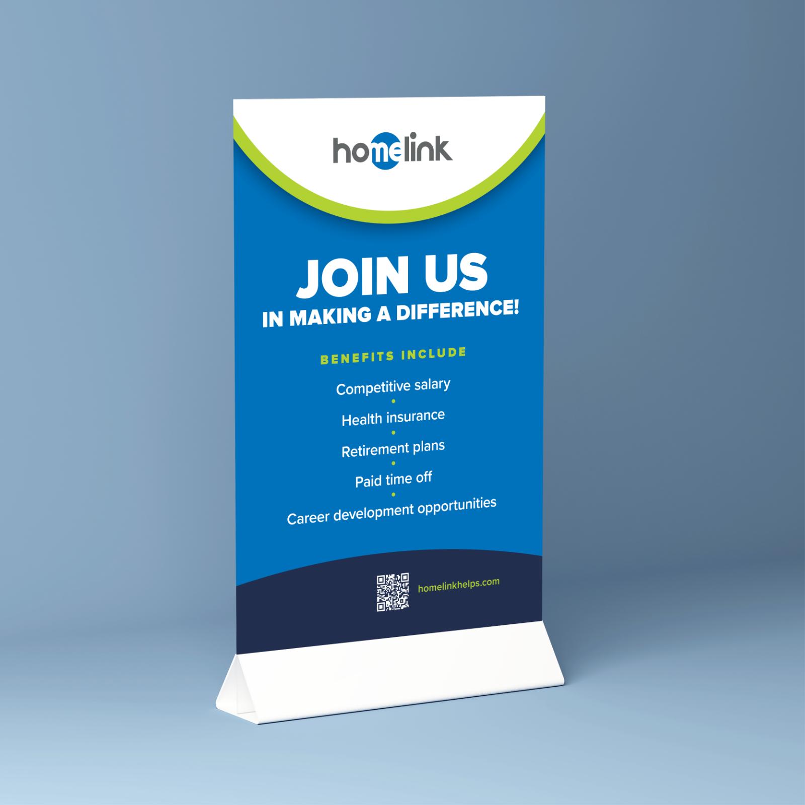
Homelink needed their new identity and graphic system applied to marketing materials with an urgent need for tradeshow materials – from a back wall and pull-up banners to tabletop displays and handouts. With a challenging new color to replicate across all media, we used experimentation and analysis, to preemptively anticipate how the color would manifest across diverse platforms – from the luminous glow of digital screens to the tactile texture of printed materials.
We’ve helped Homelink and others elevate their brand presence through captivating design and impeccable craftsmanship. Whether you’re looking to make a splash at a tradeshow, attract top talent, or make meaningful connections, we’re here to bring your vision to life.
“I have had the pleasure of working with Gigi and the Korzenowski Design team for years. Their excellence in every project has been nothing short of outstanding. I fully trust their vision and expertise, and they consistently elevate our brand with fresh energy and creativity. They have been instrumental in bringing new life to our marketing assets. I would recommend them to anyone looking for a truly collaborative partner who understands the importance of both creativity and strategic impact.”
Hannah Garvin, Senior Marketing Manager, Homelink
Does your brand need a boost? Contact us to get started!
ClientHomelinkServicesBranding and visual identity, Print communicationsTagsb2b, trade show, print, branding