
THE WESLEYAN SENIOR LIVING AND HEALTHCARE
Logo Refresh
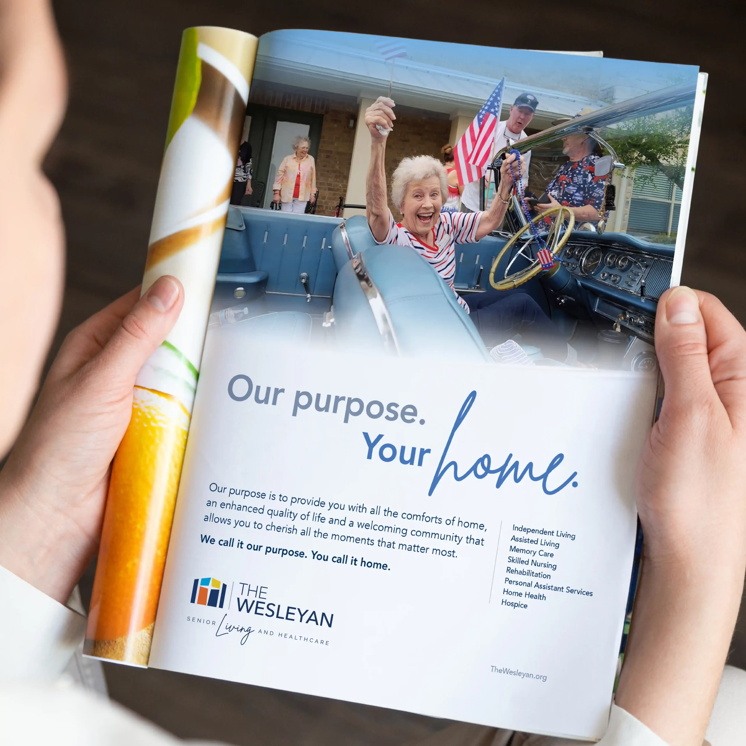
Same heart. New life.
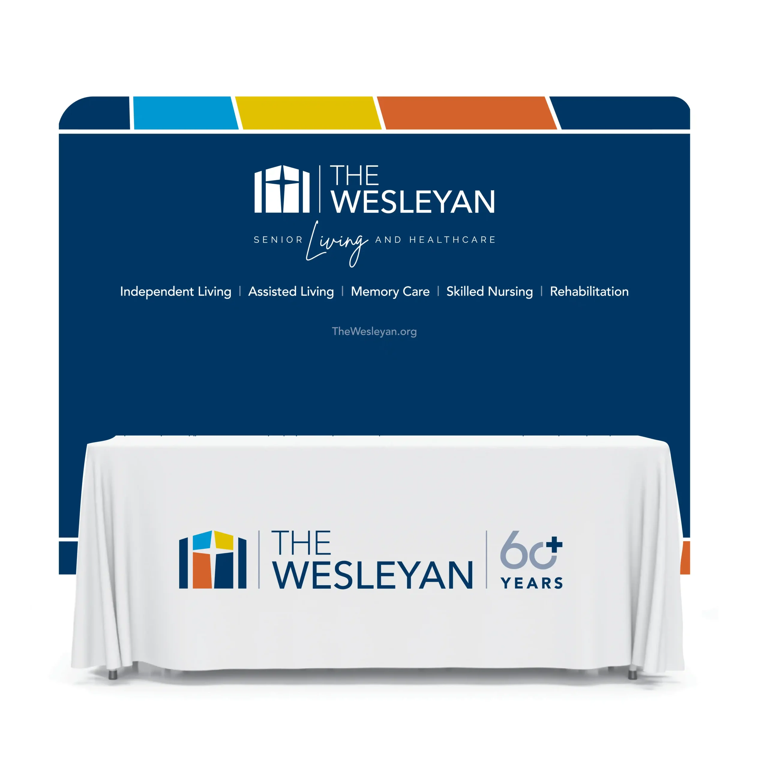
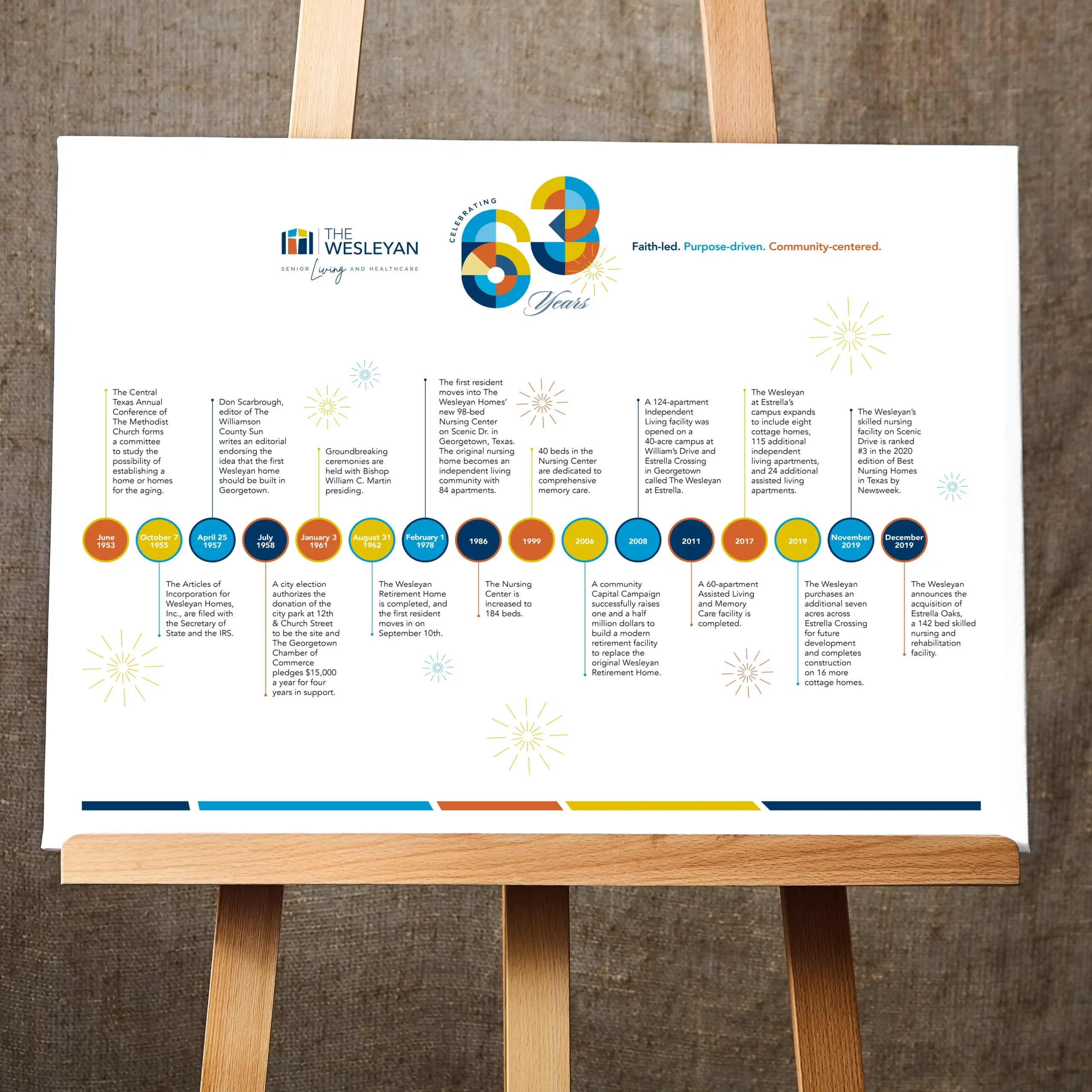
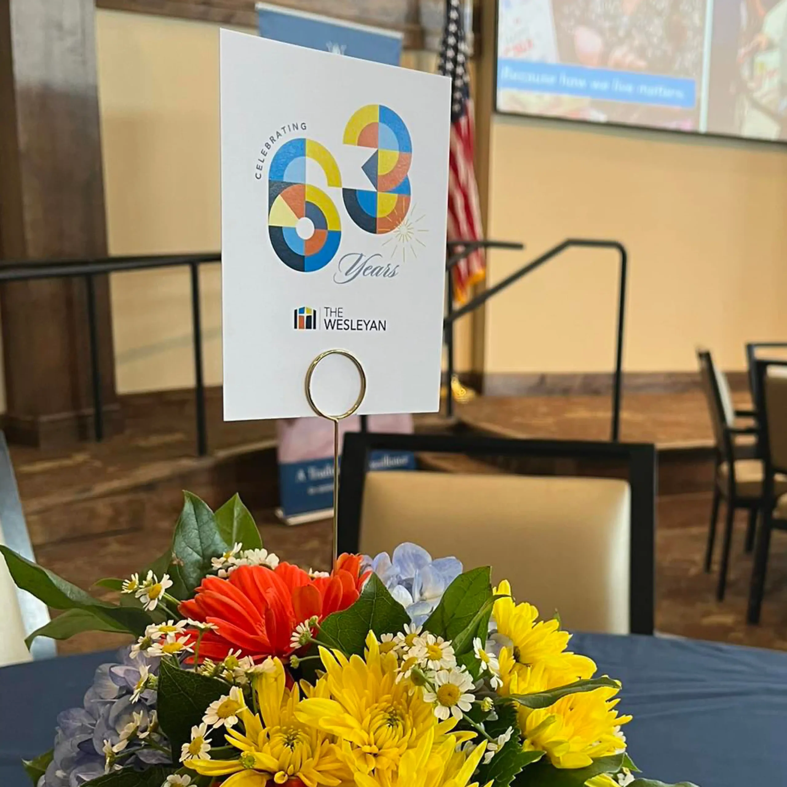
The Wesleyan’s logo had a strong foundation, but the color palette felt a bit subdued. By introducing four vibrant new colors and pairing them with energetic lifestyle photography, we infused fresh energy that better reflects their thriving community.
We also introduced a clear, descriptive tagline — Senior Living and Healthcare — bringing clarity to the brand name while highlighting Living in script to emphasize vitality and lifestyle.
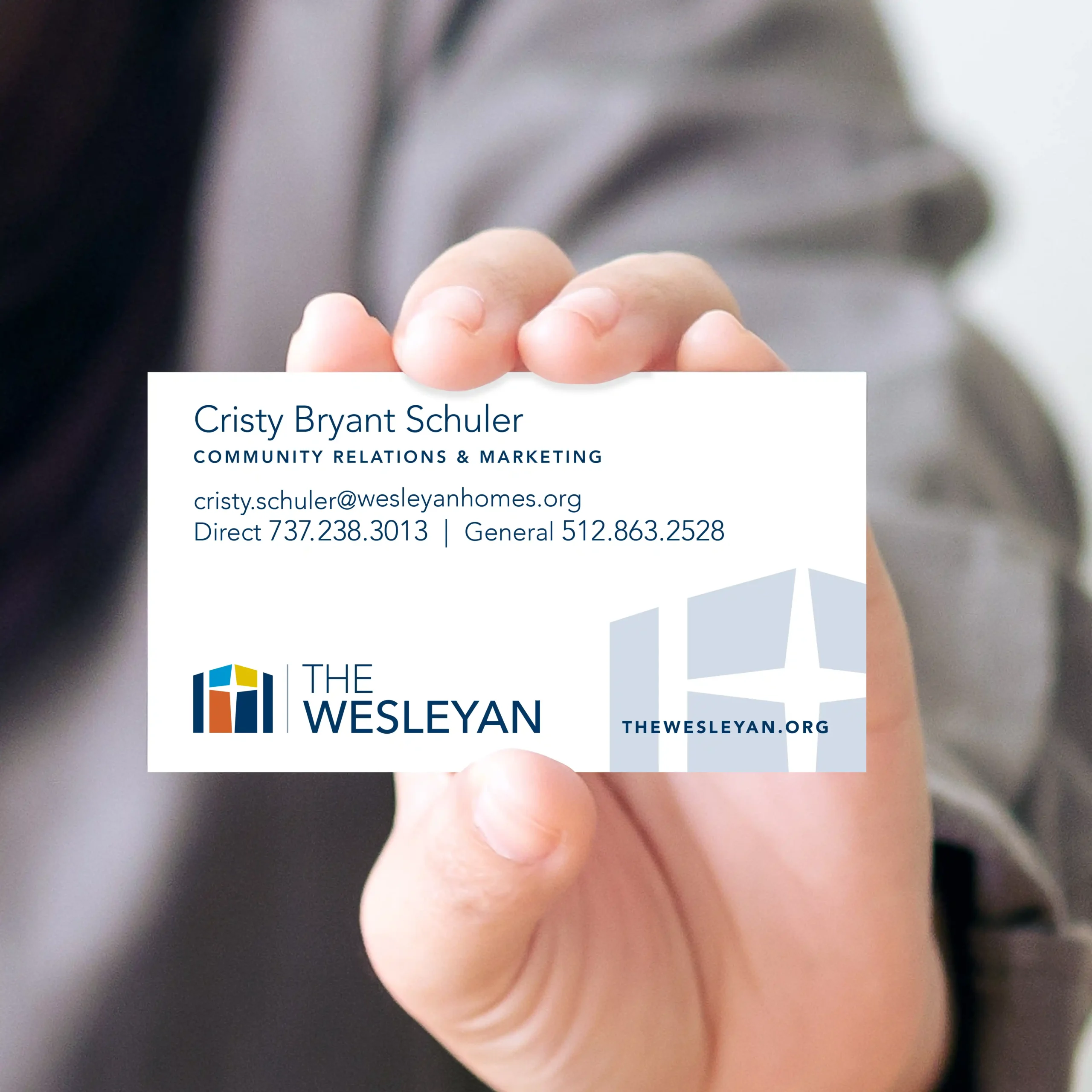
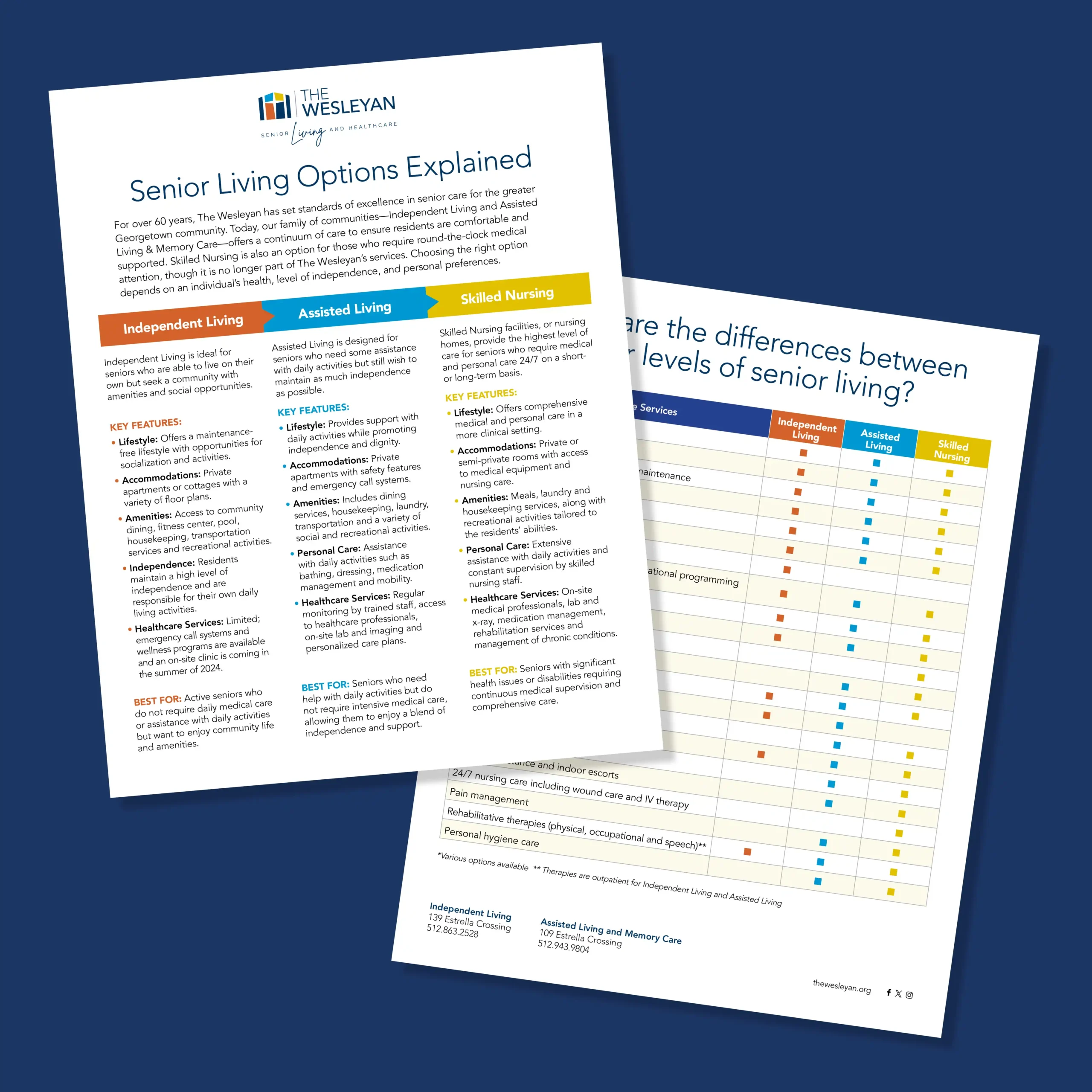
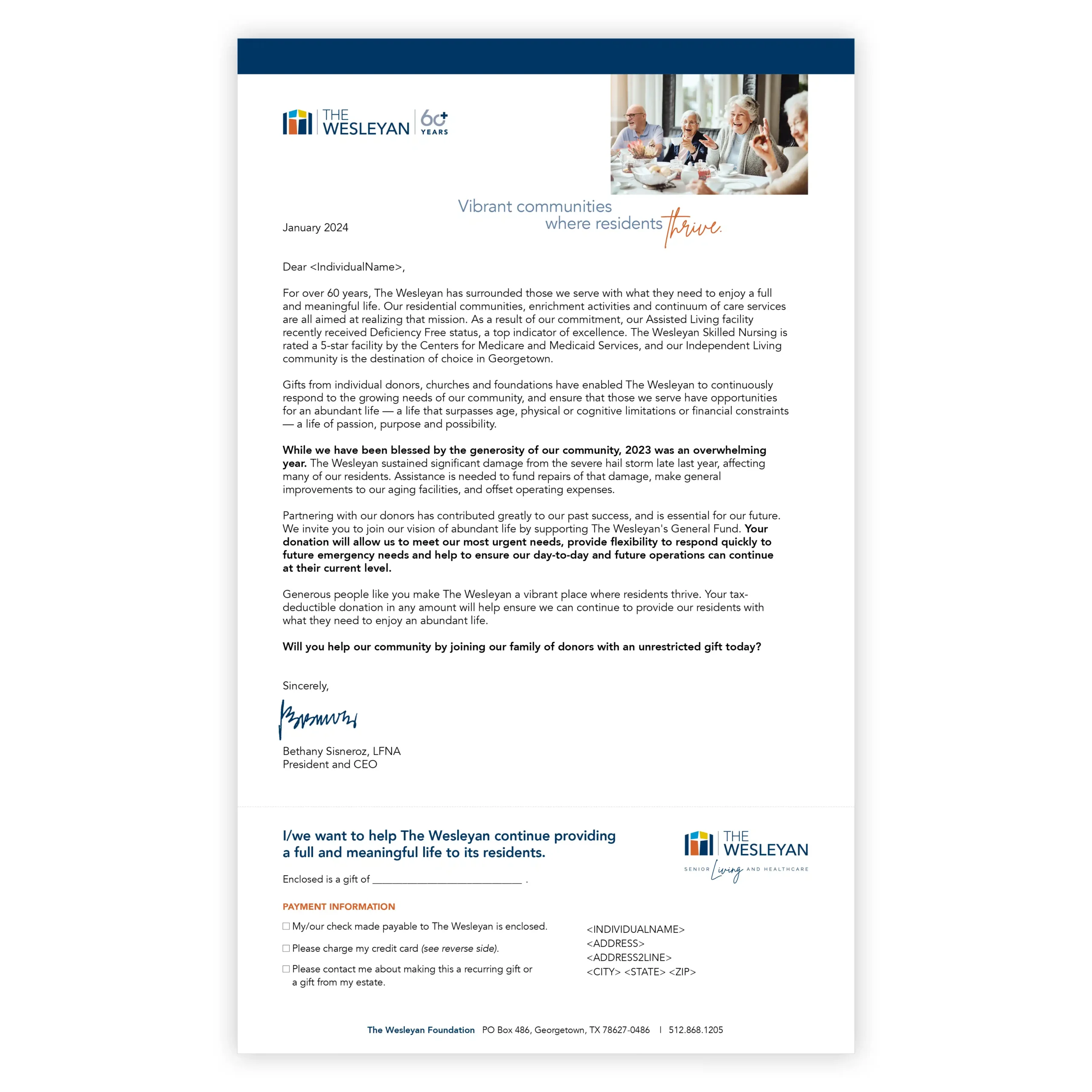
Rolled out across print and digital, the result brings renewed life and meaning to every touchpoint.
• Refined logo presentation
• Expanded, cohesive color palette
• Introduced descriptive tagline with lifestyle emphasis
• Consistent application across print and digita
Now, their marketing feels as vibrant and clear as the people it represents — faith-led, purpose-driven, and community-centered.
If you want to refresh your company’s logo, contact us—we can help.
ClientThe WesleyanServicesBranding and Visual Identity, Advertising, Print Communications, Direct Marketing, Online and Interactive, Marketing Strategy Consultation, Creative VisualizationTagsb2c, recruitment, advertising, branding, print, digital